


On the Moodboard: Rebecca Atwood's Vivid Color Visions
"That experience of color is really the world I want to live in. I would like to live there and maybe not on my phone."


“When I look out into the world, I don’t usually see a totally flat color,” Charleston-based designer Rebecca Atwood tells me. “There’s texture, there’s the way the light is hitting it, there are shadows. I really wanted to work on some fabrics that captured that feeling.”
Talking to Atwood, her extreme sensitivity to color is abundantly clear. Her passion for its elasticity and for the way that different tones speak to each other isn’t limited to her working life. For her first collection of solid designs—two woven fabrics, one fiber wallpaper, each in several different hues—Atwood sought to represent the variety of emotions and experiences that color symbolize to her. Though these fabrics appear as textured solids from afar, their magic is how they crack open when viewed up close, revealing a full spectrum of shades that combine to create the tone you see from afar. My personal favorite is the Bramble in Chroma, which reads like a dusty brownish gray at a distance, but is made of peach, pink, blue, green, cream, and black up close.
“There's something about sitting on a nice fabric that invites you to be more introspective,” Atwood explains. For Atwood, being thoughtful about color isn’t just about creating as beautiful of a fabric as possible, but about opening users to a different kind of experience with space. Below, we discuss the experiences and visions that the designer poured into three specific weaves from the collection.

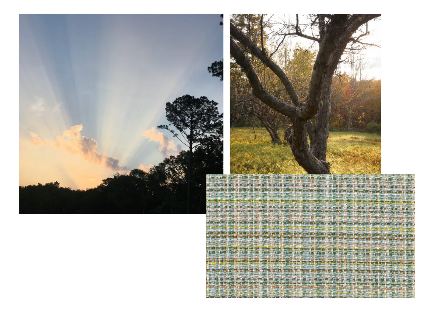
THE FABRIC: Bramble in Blue Hour
REBECCA ATWOOD: This is a reference to a feeling and a time of day that is also a color. It’s enveloping– it stops me in my tracks when I notice. End of day, maybe putting away the dishes or closing the door to my daughter’s room. It’s being in the house and looking out at a blue world.
RACHEL DAVIES: When did you realize you wanted to make something inspired by this particular time of day?
REBECCA ATWOOD: I wrote a poem maybe a couple years ago about water and creativity and how this moment of day always stops me. It doesn't happen every day that I notice it, but when you're inside and you look out the window, it just feels blue. It's really hard to capture on camera, but it's this moment [I've always thought about,] even going back to when I was at RISD. I was learning to paint and I was struggling with art school and crits. I think I was a sophomore and I was painting a kitchen still life at home. Then I went back the next night, and the sky was bright blue outside my window, so I layered blue over it, but you could see whatever I painted underneath. Everybody was like, "how did you do that?" I felt so excited. That was one of those moments that really made me recognize that that moment of day is something I always love.
My friend Charlotte and I will send each other texts about color. You can't capture this blue really, it's alive in this different way. With the fabric, I was thinking, how do I make a blue that's exciting, but still really usable? Having those neon bits, maybe that's not quite how the sky looks, but it's the feeling. It feels electric, and looking at it, it feels almost like there’s water outside your house. It has an energy to it, there's a weight to it.

REBECCA ATWOOD: I feel like this fabric is kind of like the city, like you're just walking around, and then these things that are maybe not what you'd put together come together in a really beautiful way. This fabric reads like a complex, warm, gritty neutral from a distance. It’s colorful and unexpected, made of small moments up close and then the overall thrumming of it as a whole.
RACHEL DAVIES: Are there any specific textures from the city that you think of in relation to the fabric?
REBECCA ATWOOD: So I lived in New York for over 12 years, and these are mostly pictures I took on trips that I was back visiting. This fabric actually reads really neutral when you upholster it and put it on, it looks like, almost like a warm gray or brown, but up close, it's so colorful. The city kind of has that vibe. The colors of the old stone buildings, I think about Union Square. I used to get off there a lot at one point in time and the farmers market, and it reminds me of those colors. Then having all these pops from people walking around or lights. So I feel like that for me, that fabric feels unexpected, and it has like a thrumming energy to it. Looking at the fabric, I was like, "Oh, this reminds me of New York. It reminds me of living there." For me New York is about walking around and seeing all of these different things coming together. I miss that like walking as a way of getting somewhere—I drive now, and I hate driving. Walking everywhere, you're almost just taking in all these images quickly and that's what the fabric feels like. It's got a speed to it, it's moving, it's blending together.
THE REFERENCE: What color is it when the sky is first lighting up? It’s not one color, but it is a time of day I often see this subtle green in the sky. We don’t usually think of green as a sky color so I love that. I look for it.
RACHEL DAVIES: These colors feel so joyful in this fabric. Can you tell me about figuring out these pairings?
REBECCA ATWOOD: I wanted this one to feel light and not muddy, but when I look at it, I still get this moment of like, "Is it green? Is it blue? Is it pink? Is it yellow?" It almost reads like it could be a linen at some point, but like, it's more blue than that. I really, really like that. For me, it's like those liminal times where you're like, you can't really ever catch it. So this fabric is that moment where your camera can't catch the color. It's happening so quick. I think about that as that green moment in the sky. I don't even think there's actually green in the yarns, but the way the yellow and blue hit it makes it feel green. It just looks like there is light hitting it. It's just pretty.
RACHEL DAVIES: It makes me think of how much of our experience of color is flat color on screen, but these fabrics are so oriented toward creating this embodied experience of color.
REBECCA ATWOOD: I know, I think it's so interesting thinking about how people experience color on a screen and how we experience color in the world. I want people to maybe experience [deeper colors in] their life. For myself too, I'm so guilty of all of these things, but I want people to have that [experience.] That experience of color is really the world I want to live in. I would like to live there and maybe not on my phone.

Thank you so much, Rachel. It was such a pleasure to chat color with you. 🌈