


My bathroom is orange now!
Plus other updates from out in the world

With wildfires still raging in California and myriad other atrocities unfurling across this country, the past couple weeks have been heavy. Today I wanted to share some things that have brought me relief over the past few weeks. Keep scrollin’ for a little home update, a pop-up I found delightful, and a book that I look forward to spending reading with each night.
HB2 pencil–colored walls
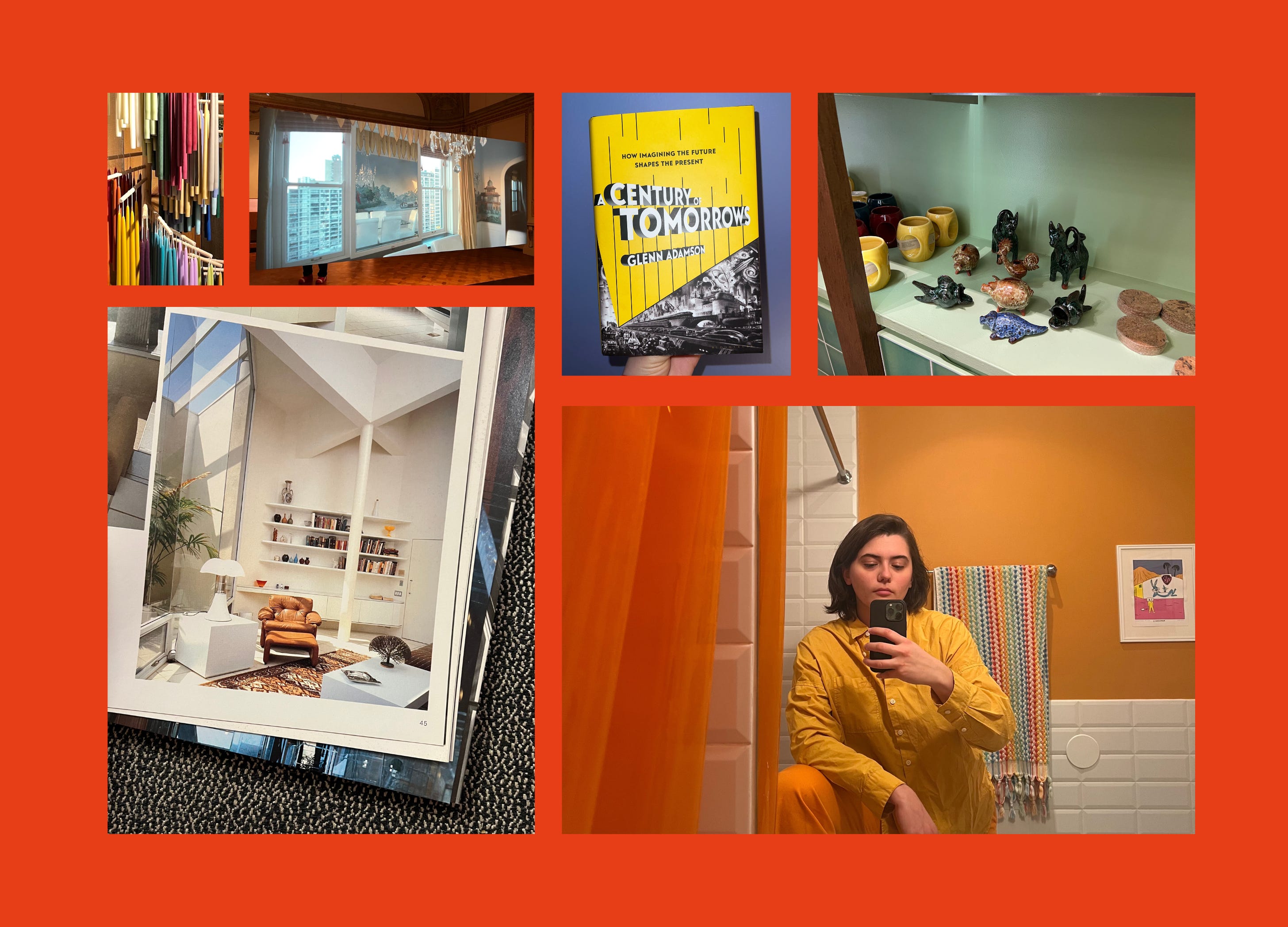
I’ve lived in my current apartment for almost three years. For the entire time I’ve been here, this bathroom has bored me out of my mind. I hate complaining about what is, functionally, a perfect bathroom. In my first apartment, I couldn’t even stand up in the shower, so this is a definite upgrade. Still, the space was no better than your average public bathroom: a place to get in and get out of and not much more.
I started the New Year off ambitious. I could change it! I could finally conquer my perfectly fine but ultimately disappointing bathroom. I wouldn’t be able to do anything about the tile that I find abhorrent, but I could at least zhuzh up the walls.
Painting is the ultimate cheat code for giving your space personality, by my estimation. Everyone on the internet (or everyone on my internet) complains about how grey the world is nowadays, and this overwhelming blandness only means that bringing color into your own space is all that more impactful.
Someone commented on my first newsletter, which included photos of my blue office, that the decision to paint it blue was kind of questionable. You know what, it is questionable! I’m comfortable with the fact that not everybody likes it and not everybody will like my orange bathroom either. Color is highly personal. Not everybody’s going to like what I like, but when it comes time to paint, it should be a choice you make for yourself, not based on anticipating judgment. (And that includes if you prefer grey walls!)1 Plus, when you choose what you really like, it makes it all the more meaningful when you find people whose tastes you align with.
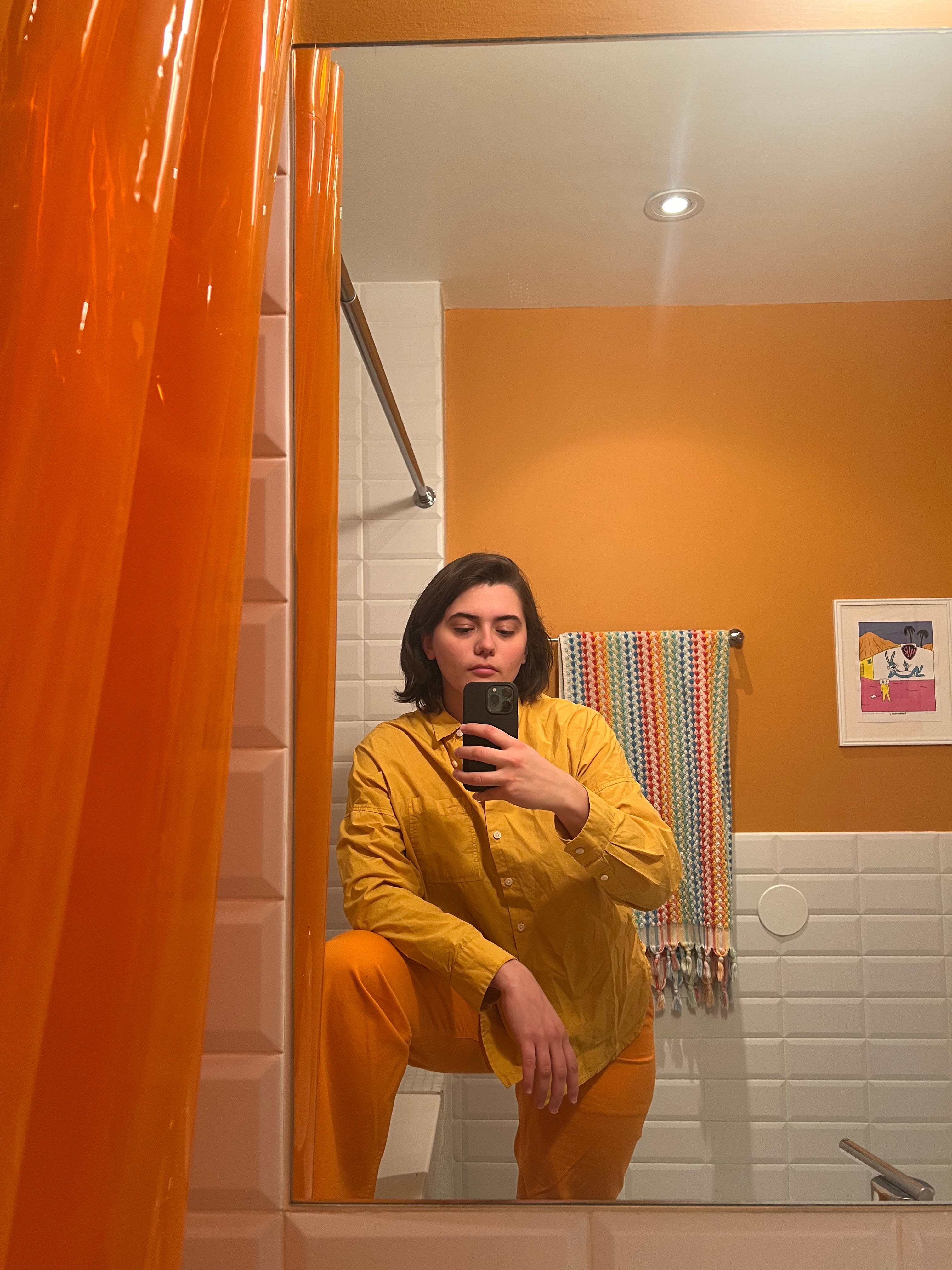
The color I ultimately chose was Backdrop’s “Color of the Year.” When it first launched a couple years ago, I was completely smitten with the tone. It has the pop of a loud orange, but an ever so slight hint of earthiness that keeps it from feeling like I’m creating some kind of Nickelodeon-branded moment. It was fresh on my mind as I decided what color I’d want for the bathroom because I interviewed Backdrop founder Natalie Ebel in December. Plus, I realized I had a couple of prints with orange elements in them that were laying in a drawer, so it just felt right.
My mom used to be a decorative painter so I enlist her anytime I need help with a painting project. (I’m very lucky!) She came to visit last weekend, and voila, I had a newly painted bathroom without lifting a finger.
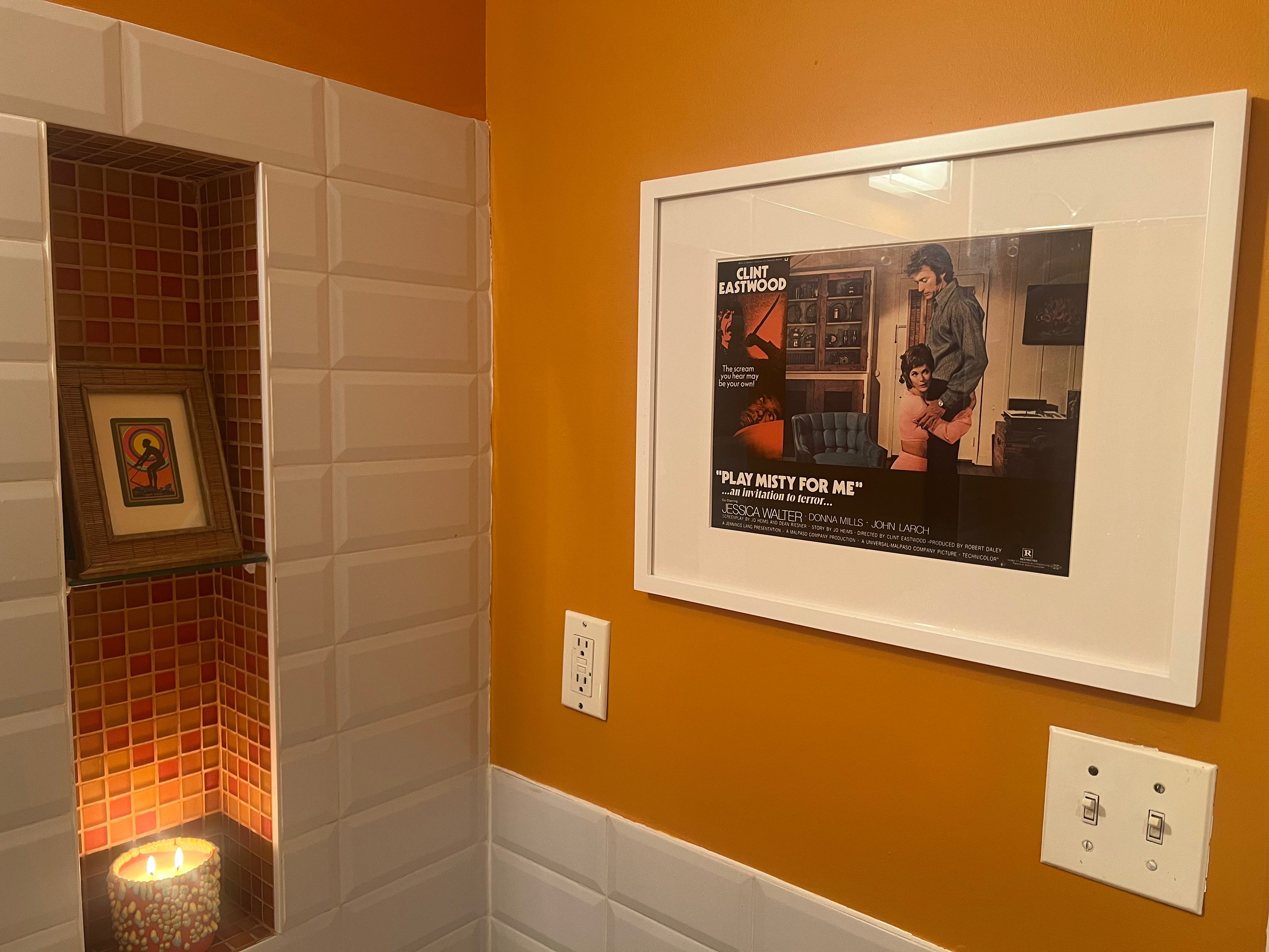
It looked very cute, but it was clear that I needed something to break up the big orange expanses. I convinced myself that I was going to invest in getting the aforementioned prints custom framed, but after putting it off for weeks, I realized it just made more sense financially to buy frames from Target. I have this vision in my head of the True Cosmopolitan Lifestyle which features custom framing prominently. But I’m trying to be more honest with myself about my needs vs. my wants. I had to let it go!
I popped over to Target and grabbed two frames for like $30. Within a half hour my bathroom was all set. Unanticipated upside: no need to wait for the framers!
Altogether, I spent $65 on the half gallon of paint and $30 on the frames. There are still tweaks here and there I’d like to make—a new towel bar and new switch plates, for instance—but still, a pretty significant change for less than $100!
A pop-up at the MoMA Design Store


It’s impossible to hide that I’m a MoMA Design Store superfan—three of the furniture pieces in my office + in the Personal Space branding are from the shop. A couple of weeks ago, I trekked to the location in SoHo for a discussion on Portuguese design between A Vida Portuguesa founder Catarina Portas, illustrator Jorge Colombo, and MoMA Design Store director of merchandising Emmanuel Plat.
Celebrating its 18th year in business this year, A Vida Portuguesa is a gift shop with five locations across Portugal that showcases Portugal–made goods. Through March 10, both MoMA Design Store locations have A Vida Portuguesa pop-up sections which feature a curated selection of goods from the Portuguese shops. There’s art supplies and blankets, plus less expected additions, like tin fish and cologne.
At the talk, Portas discussed her vision for the shop to be a place not just for tourists to come and experience some simulated version of Portuguese craftsmanship, but a space where Portuguese people could rediscover their own country’s heritage designs, too. One guest asked about the role that nostalgia plays in curating a shop so dedicated to traditional craftsmanship, to which Portas replied that the project was always about identity, not nostalgia.
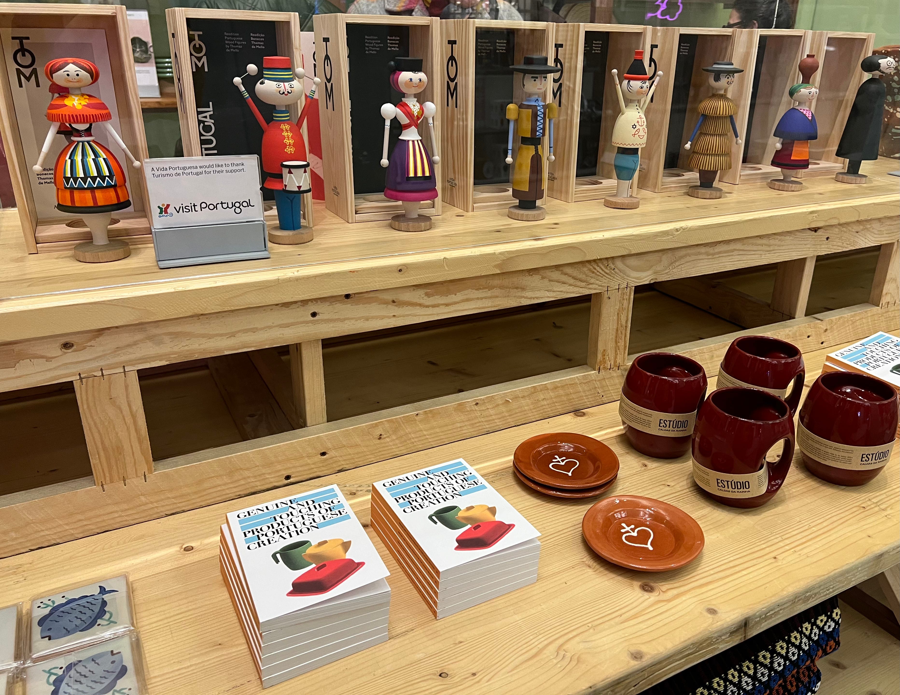
Nonetheless, I am the tourist shopper and visiting the pop-up section after the talk felt like a mini-vacation. It was a quick dose of the joyous feeling of finding a shop filled entirely with goods you’ve never seen before when you’re in a foreign place. Another welcome discovery: there are many items under $10! I grabbed myself a little book and I bought my partner this mini basketball game. We’d just found out the day before that his family lost their house in the fires, and a lot of his childhood mementos along with it. I thought it was something he would have loved as a kid so it seemed like a sweet gift. Still, it looks really cute on a shelf now amidst his other basketball memorabilia.
A recent book talk


Earlier this month, my friend Phoebe and I went to a discussion between Alexandra Lange and Glenn Adamson on Adamson’s recently published book, A Century of Tomorrows. The book is about futurologists of all stripes from the 20th century—the category is broad, but think self-appointed prophets, trend forecasters, and industrial designers.
I wasn’t familiar with Adamson’s work prior to hearing about the talk, but he’s a writer and curator who’s worked at the V&A, the Museum of Art and Design, and the Vitra Design Museum, where he currently works. Back in the fall, I’d been reading a lot about the Jet Age and that particular period’s vision for the future, so when I saw the flier for the book event going around I knew it would be right up my alley.
At the talk, Adamson mentioned insurance being a kind of futurology, then joked about not wanting to scare people off by making it sound boring, but that only made me more excited to read it. I’m about 100 pages in and I’ve been really enjoying it. It’s the kind of book that I need to have a pen near me while reading—there are so many little offshoots I want to research more and findings that I want to remember. Beyond the broader stroke learnings the book presents, there are so many interesting little historical tidbits. One extremely puny (but still satisfying) learning: Nabisco is short for National Biscuit Company.
At a time when it’s hard to imagine the future with any shade of optimism, it’s oddly comforting to read about how wrong people have been, throughout time, about what the future has in store.

Despite not personally caring for grey, I am a grey defender in some instances. Read my AD piece on millennial gray here.
The bathroom wall looks sooo good!!!