


I finally solved my magazine storage problem
Kinda...! + other notes from the offices of Personal Space 🧑🏻💻

I am a collector. There’s no getting around it. I particularly love to collect magazines and books. Whatever way they come into my life is fine: found on the street, in a free pile in a building lobby, or purchased with my hard-earned money. The best compliment is a friend saying “I was going to buy this, but I figured you’d already have it” and being able to prove their inkling correct.
The social element is a crucial part of my collecting impulse. I want to be able to share with friends readily and without any friction. That’s why I found the existing magazine storage set up in my apartment so maddening. I had my magazines on a book case right in front of my doorway. It was rare that anyone ever engaged with the contents of the bookshelf. I have two magazine racks as well, but they’re only able to take on so much. For years, my magazine collection stayed mostly untouched, aside from solo spelunking.

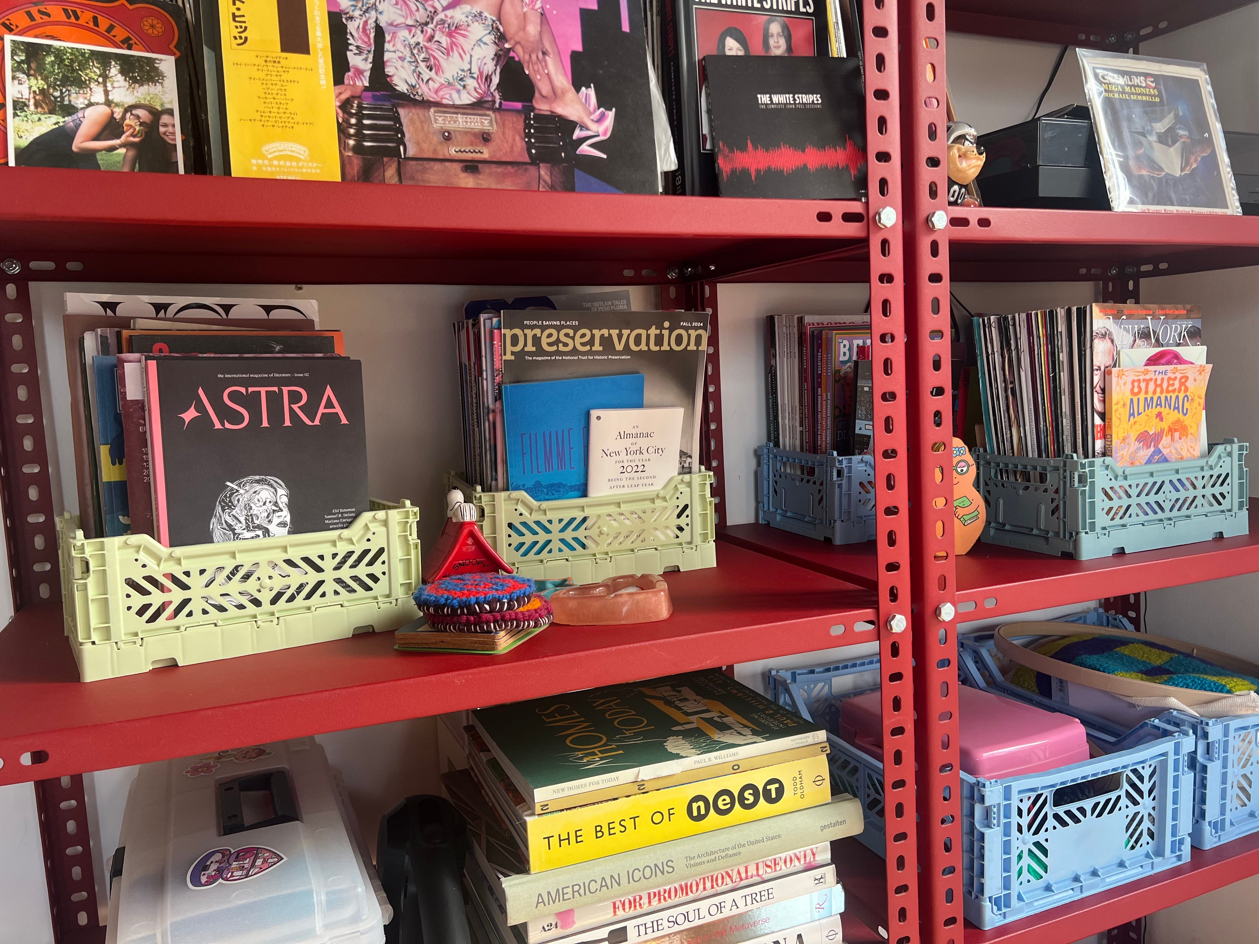
Behind my dining table, to the left of the living room couch, are two red HAY shelves. (From what I can tell, they don’t make ‘em anymore, but for posterity, the one’s I have are this shelf. I got them in 2023 for less than $300 a pop/more than 50% off.) I was overjoyed when I got these shelves. The color brings a warmness to what’s otherwise rather industrial form. But their relatively large size actually makes them a bit difficult to maximize. Storing just books on ‘em doesn’t utilize their full depth.
I had a bunch of HAY1 crates lying around that I’d originally bought for the house I lived in in LA years ago. I realized that their length make them the perfect size for storing magazines. The fact that they face outwards makes it easier for people to a) notice them and b) grab a digestible chunk, rather than being intimidated by taking a bunch of loose mags off of the shelf.
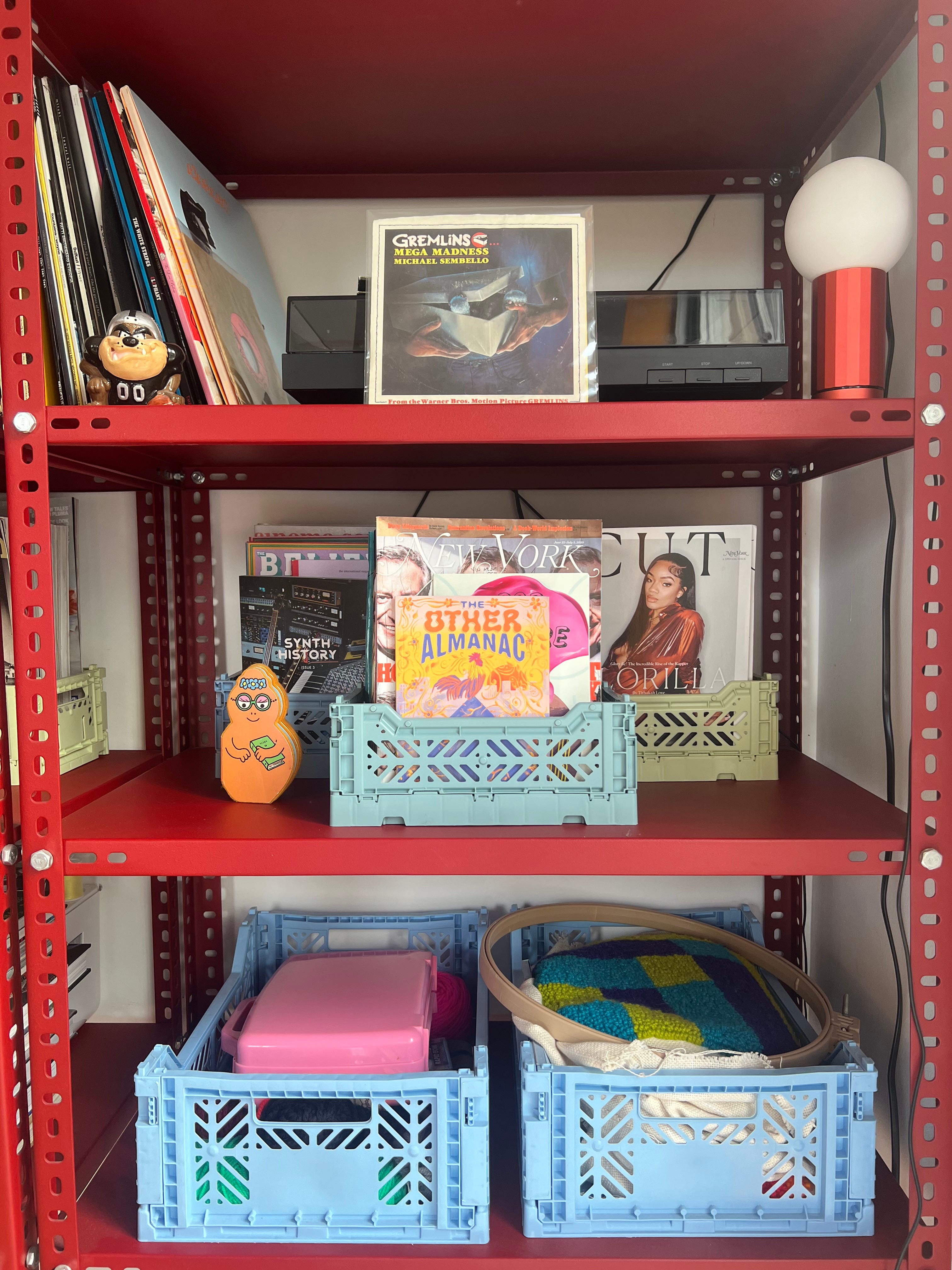
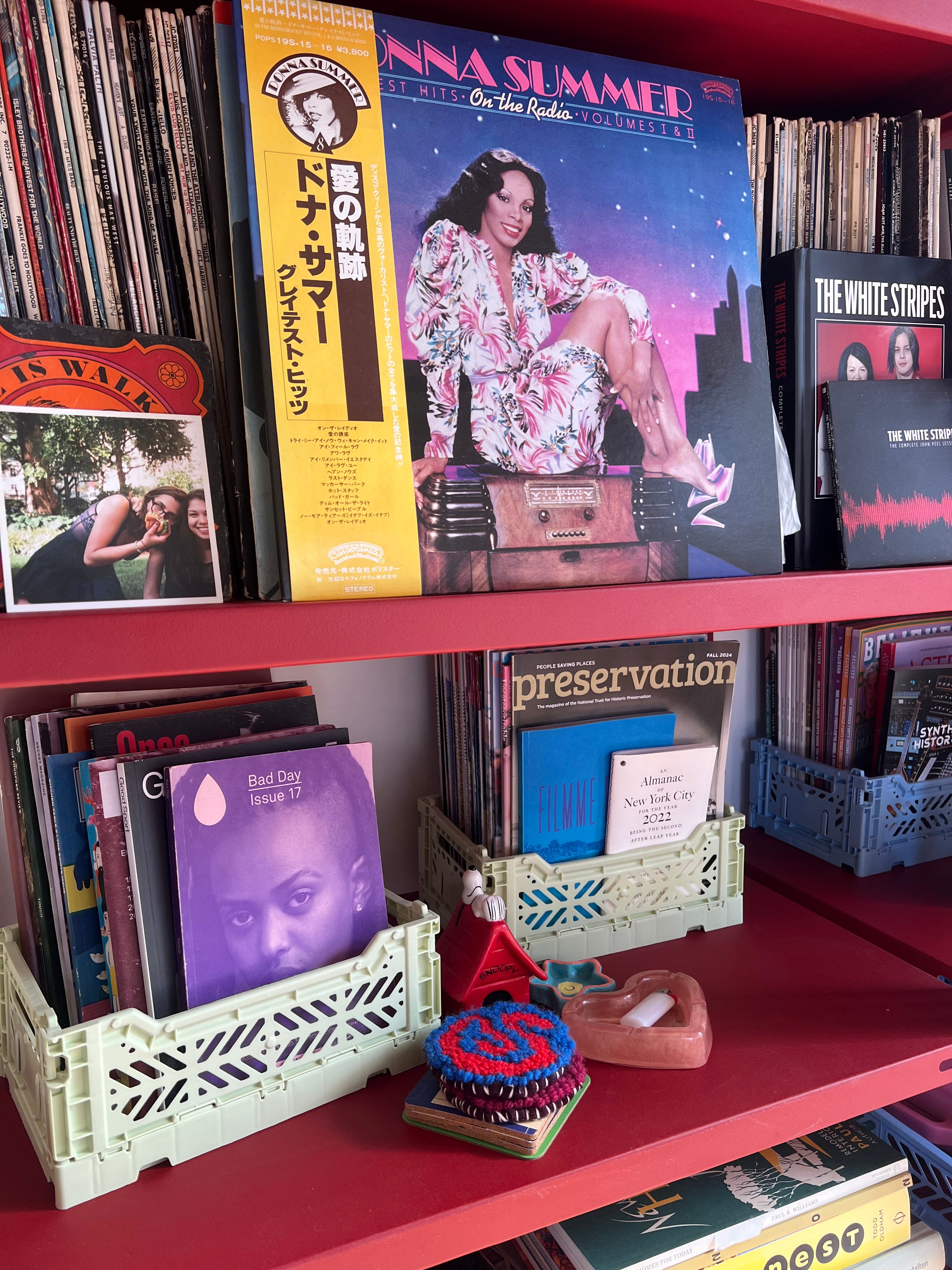
More importantly than anything else, I’ve had more conversations with friends about the magazines. Taking a crate off the shelf and looking through them together is a fun activity that doesn’t require staring at a screen. I’ll need to add another crate soon as the pile of magazines grows, but there’s still plenty of space for more crates on the shelves.

In other news…
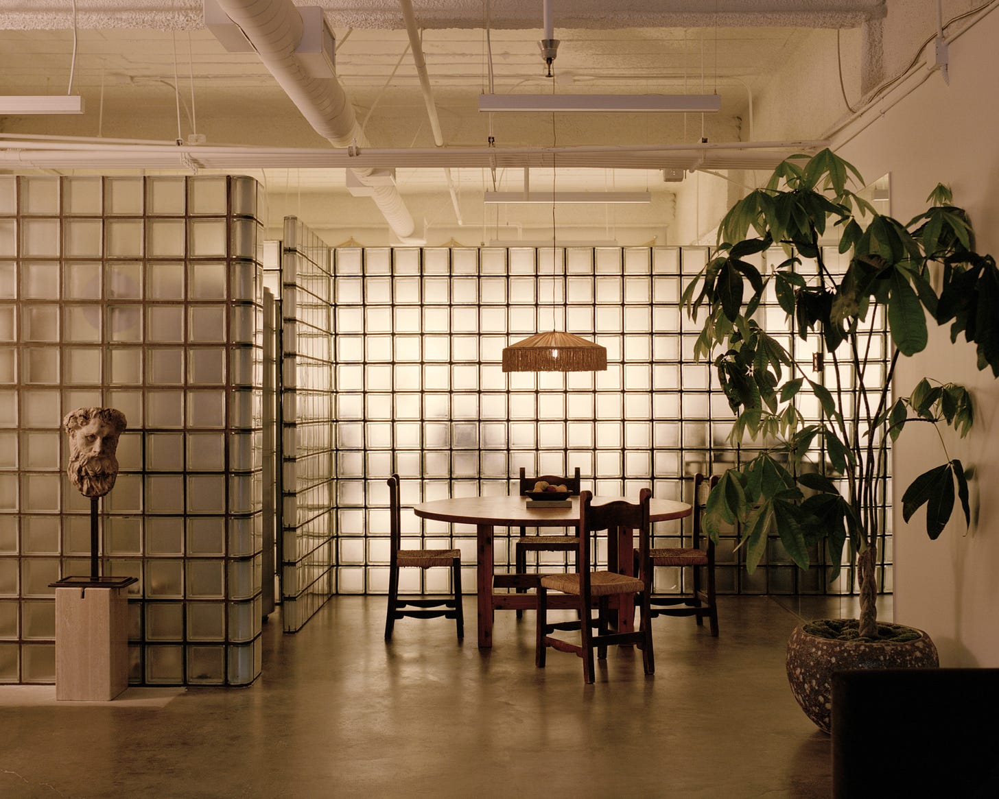
I’ve been loving the glass block renaissance taking place atm, so I was glad to see that Hannah Martin wrote about it for the most recent issue of AD. The piece also includes an image from a Tigerman McCurry Architects project from a 2007 issue of AD that I think about all the time. Chef’s kiss!
The office of MOUTHWASH Studio, designed in collaboration with Aunt Studio. Photo by Rich Stapleton. Some of the other glass block moments I’ve been eyeing lately include the new office of Mouthwash Studio (photographed above) and the Danny Kaplan Showroom. The newly opened Funny Bar has ‘em too. (The only Funny Bar glass block photo I have is my own iPhone pic and it is truly horrible. If I included it here I would quickly lose all credibility.)

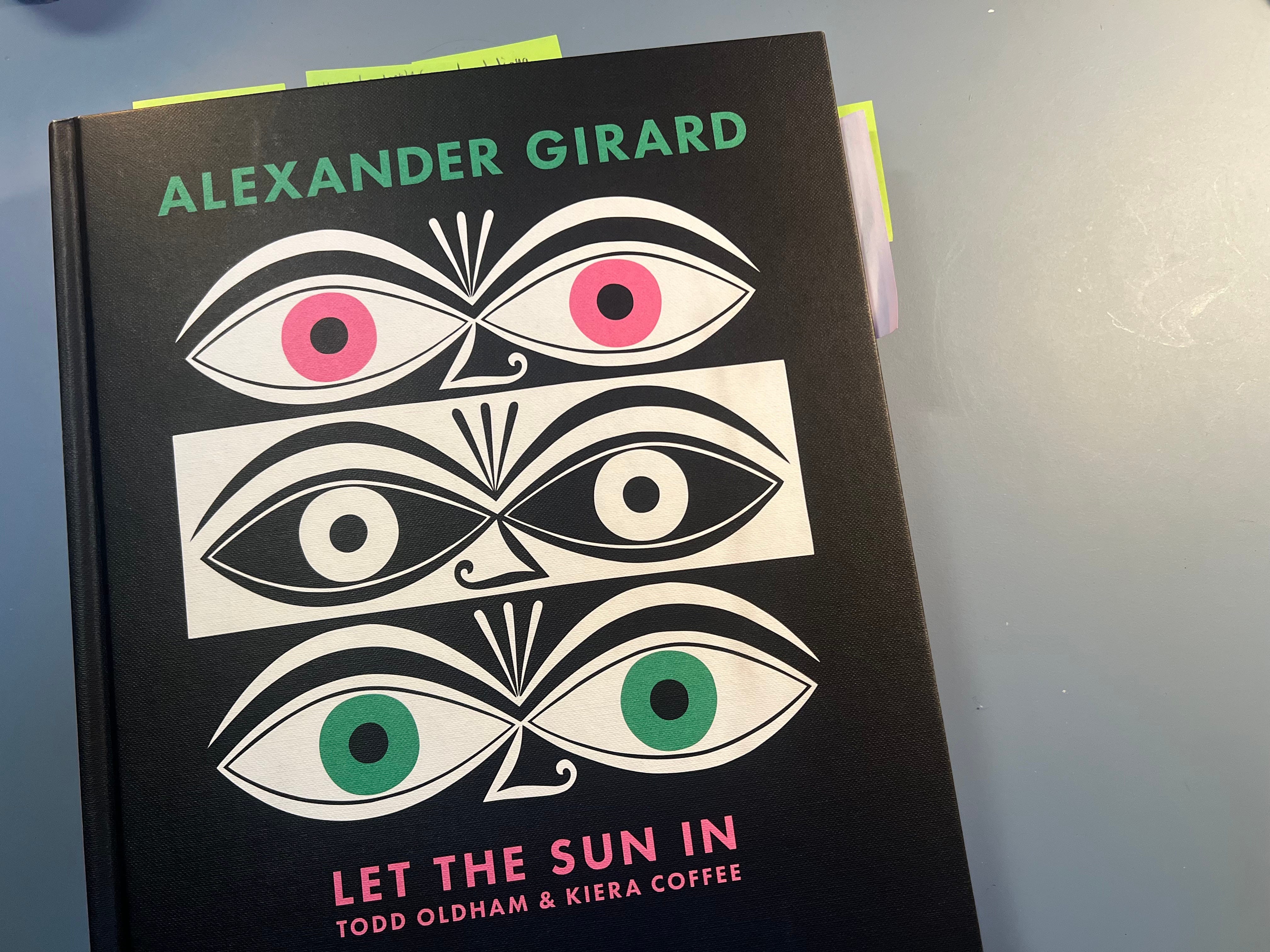
I’m finally digging into the Alexander Girard monograph which was edited by Todd Oldham with text from Kiera Coffee and released last October. If you’re not familiar with Girard’s name, you’re almost certainly familiar with his work. His colorful, spirited creations are bedrock to what most of us think when we think of midcentury design.
Not that I’m an expert by any regard, but anytime I approach a book about the work of such an influential designer, I worry that it’ll just trod the same ground I’ve already seen. I think because of how broad Girard’s output was—spanning textiles, interiors, products, curation, residential and commercial interior design—there’s still so much to discover here. I particularly enjoyed all of the sketches and photographs of ephemera.


I was tickled by Oldham sharing that he first remembers encountering Girard’s work as a kid flying Braniff Airlines in an interview with Scratching the Surface.
“I didn't really know about the idea of a designer at that time, but I sure remember the wild color combinations and the dinosaur skeleton, not kidding, that was in the DFW terminal in the 1960-70s,” Oldham told Scratching the Surface, referring to Girard’s visual identity redesign for Braniff Airlines. “The orange, red, and orange-red squares of the wool woven lap blankets are still vivid in my memory and I was so happy to find one at auction a few years ago. It's as beautiful as I remembered.”
Work for Braniff International (shoes by Emilio Pucci). I have been sick for the past week and spending wayyyyyy toooo much time in bed. I was feeling braindead and really craving documentaries. Since NYPL/Brooklyn Public Library don’t give cardholders access to Kanopy, I haven’t used the streamer in years, but my sister generously let me use her login. I ended up watching like 5 or 6 docs. I enjoyed the documentaries about Kevin Roche and Julius Schulman best. Both are available for rent on Apple TV.


Sorry, it’s HAY o’clock…! My hot tip if you’re shopping HAY is that you can get some of the stuff that’s otherwise not available in the US via the Finnish Design Shop. You might have to pay an arm and a leg for shipping tho. Otherwise DWR for most stuff, or MoMA Design Store mostly for tabletop.
Heyooo
LOVE!